Show Item Card
Overview
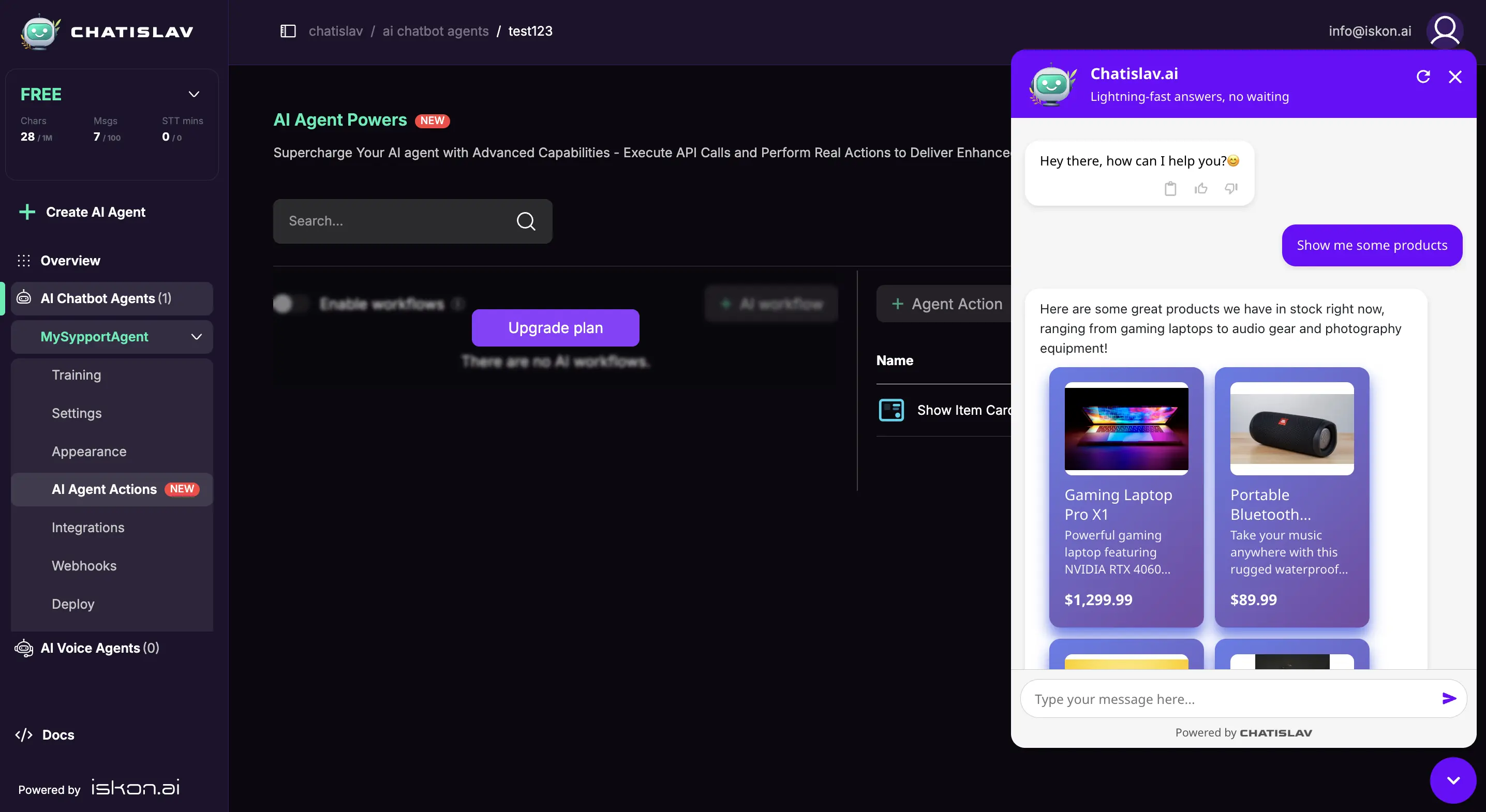
Enable your AI agent to display products, services, items, or listings as visual cards in the chat. This action creates beautiful, structured cards with images, prices, descriptions, and custom fields. Cards can be displayed in various layouts (grid, list, carousel) with full styling customization.
Prerequisites
Before setting up the Show Item Card action, ensure you have:
- ✅ A clear understanding of what information you want to display (products, services, listings, etc.)
- ✅ (Optional) Pre-defined items if you want to show a fixed set of cards
- ✅ (Optional) Custom fields beyond the standard name, description, price, and image
Step 1: Create Show Item Card Action
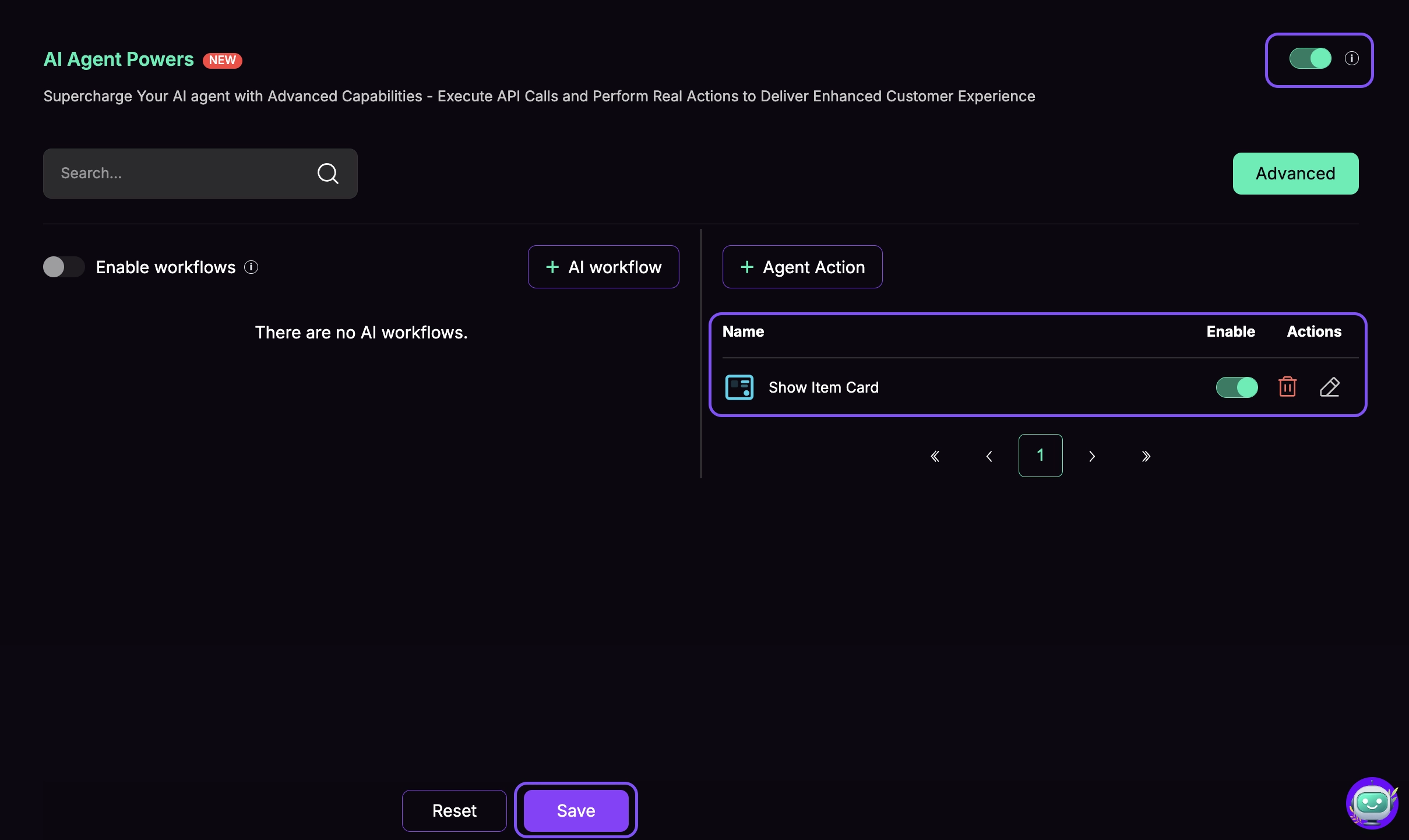
Access Agent Actions
- Go to AI Agent Actions in your dashboard
- Click the Agent Action button to create a new action
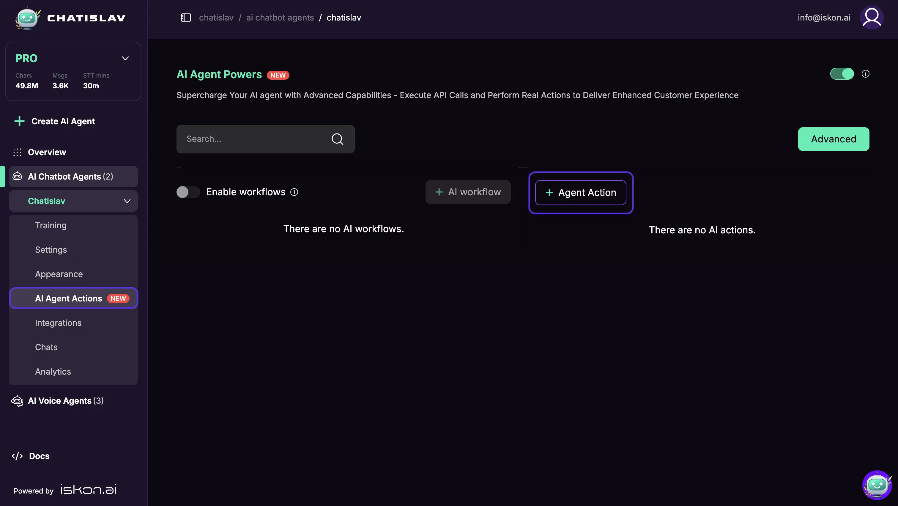
- Select Show Item Card from the list

Configure System Tool
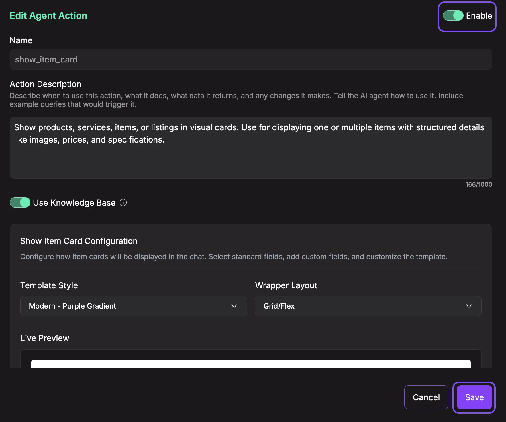
- Enable the action (toggle ON)
- Description: Describe when and how the agent should use this action (e.g., "Show products, services, items, or listings in visual cards. Use for displaying one or multiple items with structured details like images, prices, and specifications.").
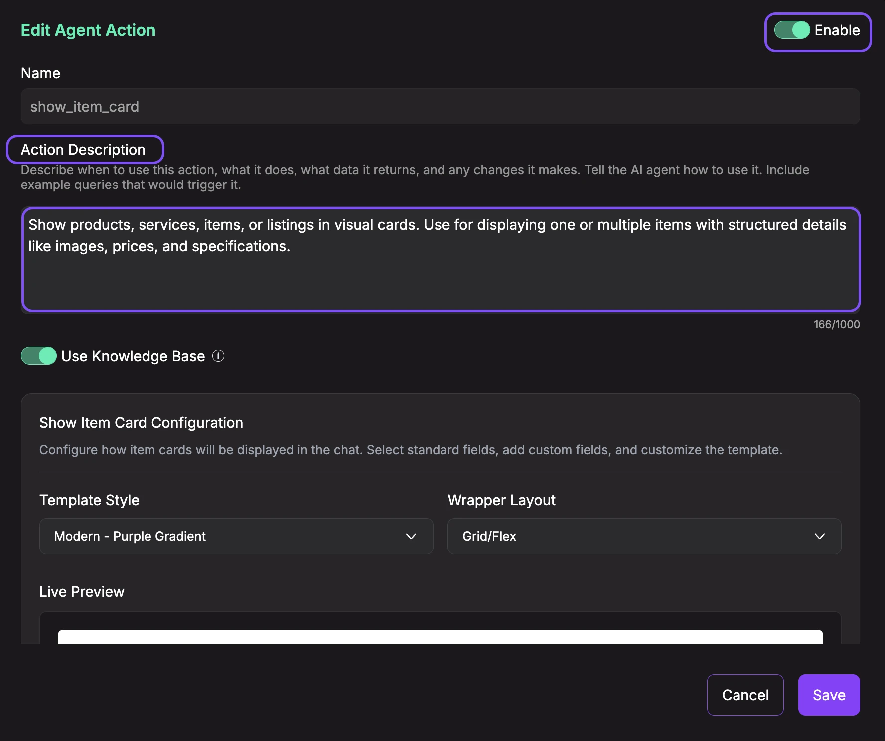
- Use Knowledge Base (toggle): When enabled, the AI agent will reference your uploaded knowledge base documents when generating responses for this action. This allows the agent to provide more accurate product information, descriptions, and recommendations based on your documentation. Keep it disabled if you want the agent to generate responses based solely on the action's prompt and conversation context.

Show Item Card Configuration
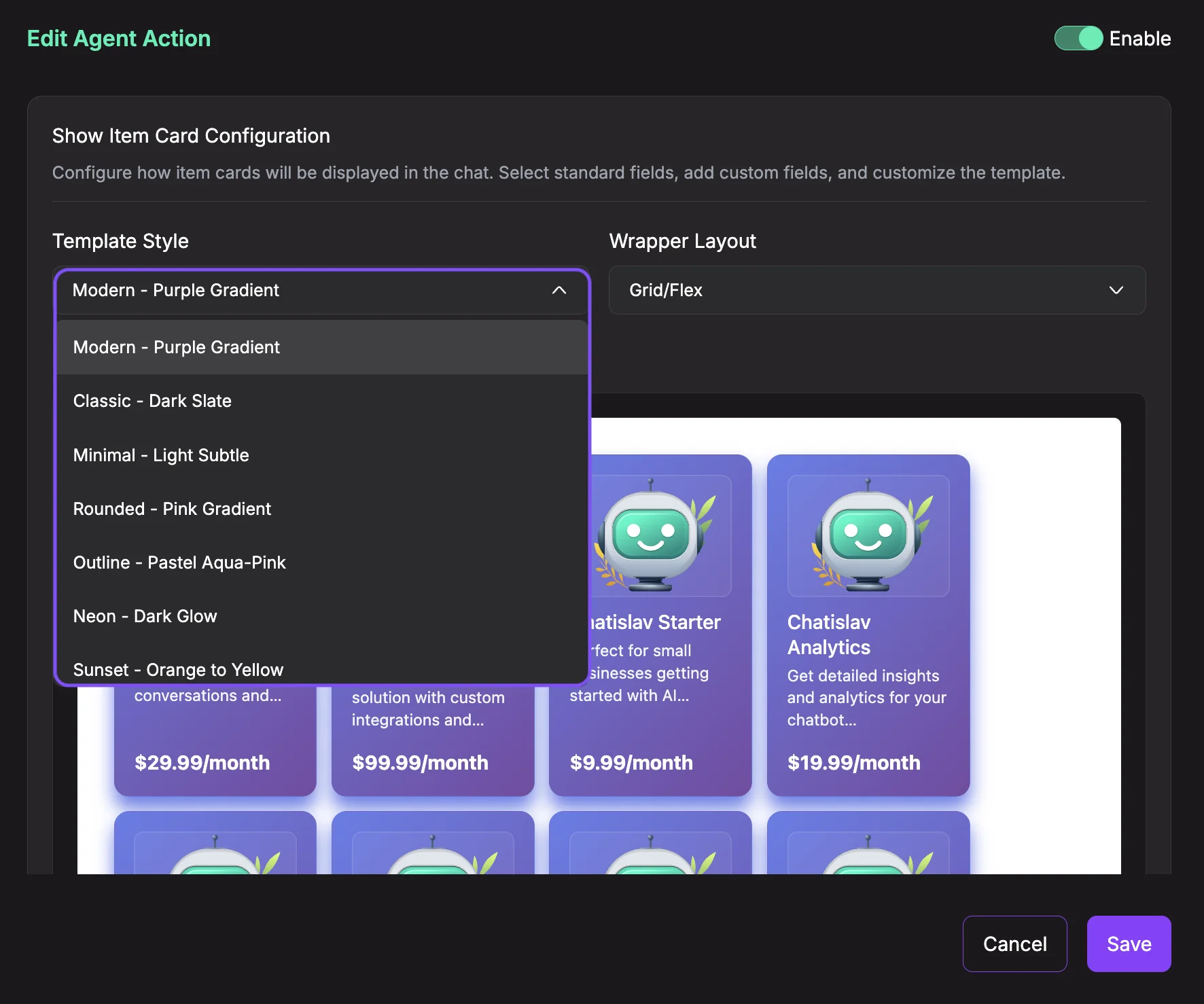
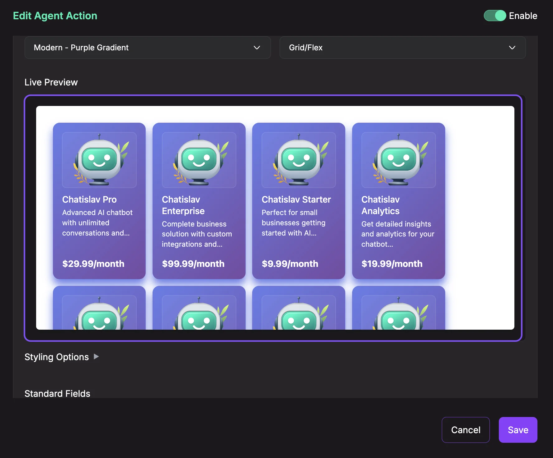
- Template Style: Choose the visual style for your cards. Available templates include:
- Modern - Purple Gradient: Vibrant gradient with modern design
- Classic - Dark Slate: Professional dark theme
- Minimal - Light Subtle: Clean, minimalist style
- Rounded - Pink Gradient: Soft, friendly appearance
- Outline - Pastel Aqua-Pink: Light border style
- Neon - Dark Glow: Bold, eye-catching neon style
- Sunset - Orange to Yellow: Warm gradient theme
- Custom: Create your own HTML template with full control
- Wrapper Layout: Choose how multiple cards are displayed:
- Grid/Flex: Responsive grid that wraps cards automatically
- List: Vertical list, one card per row
- Horizontal Scroll: Scrollable horizontal carousel
- Column: Single column layout
- Flex Reverse: Reverse order of grid items
- Vertical Scroll: Vertical scrolling grid
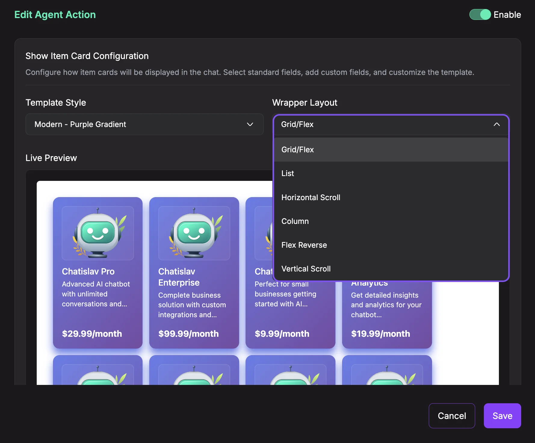
- Live Preview: See a real-time preview of how your cards will look in the chat. The preview updates automatically as you change styles, fields, and layout options.
- Styling Options (Optional): Click to expand advanced styling customization. All styling options are optional and have sensible defaults based on your chosen template.
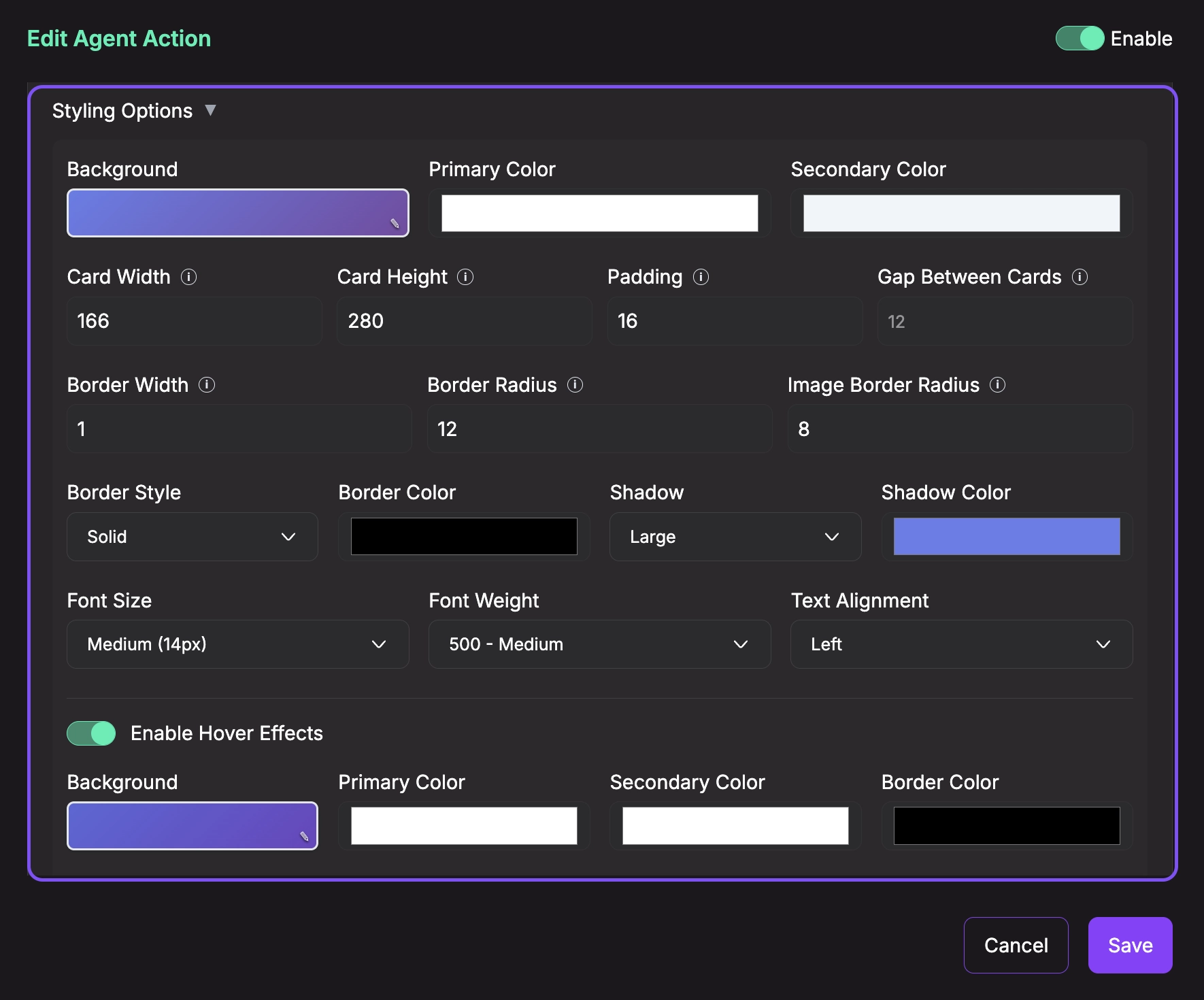
Colors:
- Background: Card background color or gradient (supports solid colors and CSS gradients)
- Primary Color: Main text color (typically used for titles)
- Secondary Color: Secondary text color (typically used for descriptions)
- Border Color: Color of the card border
- Shadow Color: Color of the card drop shadow
Dimensions:
- Card Width: Width of each card in pixels (50-2000px)
- Card Height: Height of each card in pixels (50-1000px)
- Padding: Internal spacing inside each card in pixels (0-200px)
- Gap Between Cards: Spacing between cards in the grid/layout (0-100px)
Borders & Corners:
- Border Width: Thickness of the card border in pixels (0-50px)
- Border Radius: Roundness of card corners in pixels (0-200px)
- Border Style: Border line style (Solid, Dashed, Dotted, etc.)
- Image Border Radius: Roundness of image corners in pixels (0-200px)
Typography:
- Font Size: Text size (Small 12px, Medium 14px, Large 16px, Extra Large 18px)
- Font Weight: Text thickness (100-900, e.g., 400-Regular, 500-Medium, 700-Bold)
- Text Alignment: Horizontal alignment of text (Left, Center, Right)
Shadow:
- Shadow: Drop shadow size (None, Small, Medium, Large)
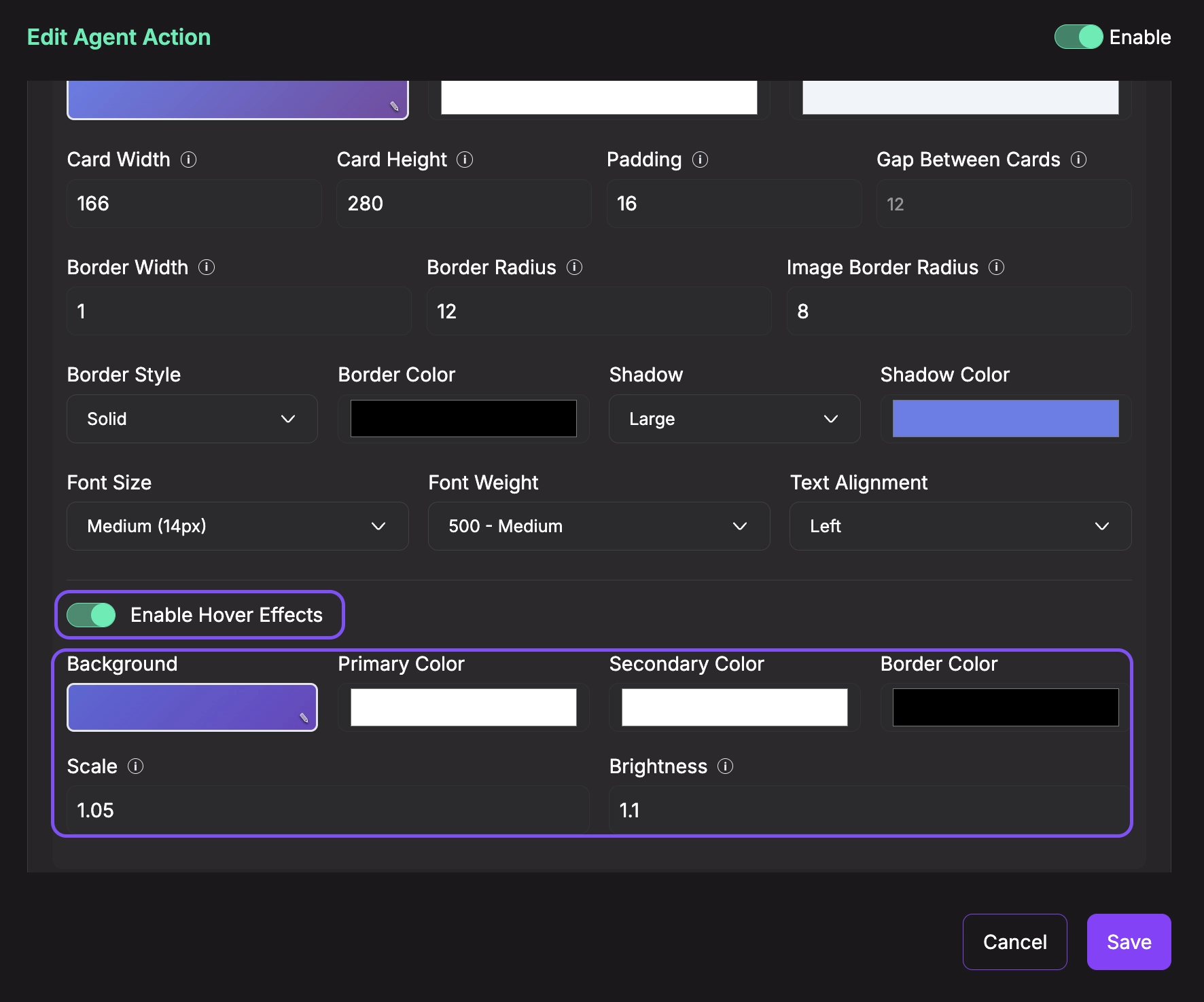
Hover Effects (Toggle to enable):
- Enable Hover Effects: Turn on/off interactive hover animations
- Hover Background: Background color when user hovers over card
- Hover Primary Color: Primary text color on hover
- Hover Secondary Color: Secondary text color on hover
- Hover Border Color: Border color on hover
- Scale: Card size multiplier on hover (0.5-2.0, e.g., 1.05 = 5% larger)
- Brightness: Image brightness multiplier on hover (0.5-2.0, e.g., 1.1 = 10% brighter)
- Standard Fields: Select which built-in fields to include in your cards. Each field has a template variable:
- Item Name (
{{name}}): The title or name of the item - Description (
{{desc}}): Detailed description or features - Price (
{{price}}): Price information - Image URL (
{{img_url}}): URL to the item's image - Item URL (
{{item_url}}): Link to the full item page
- Item Name (
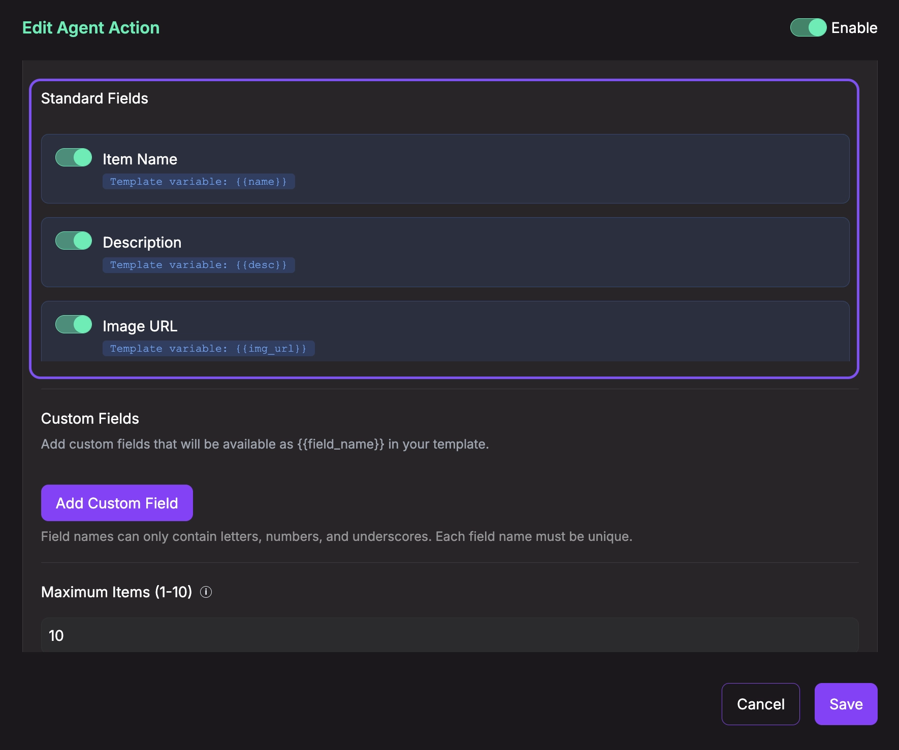
-
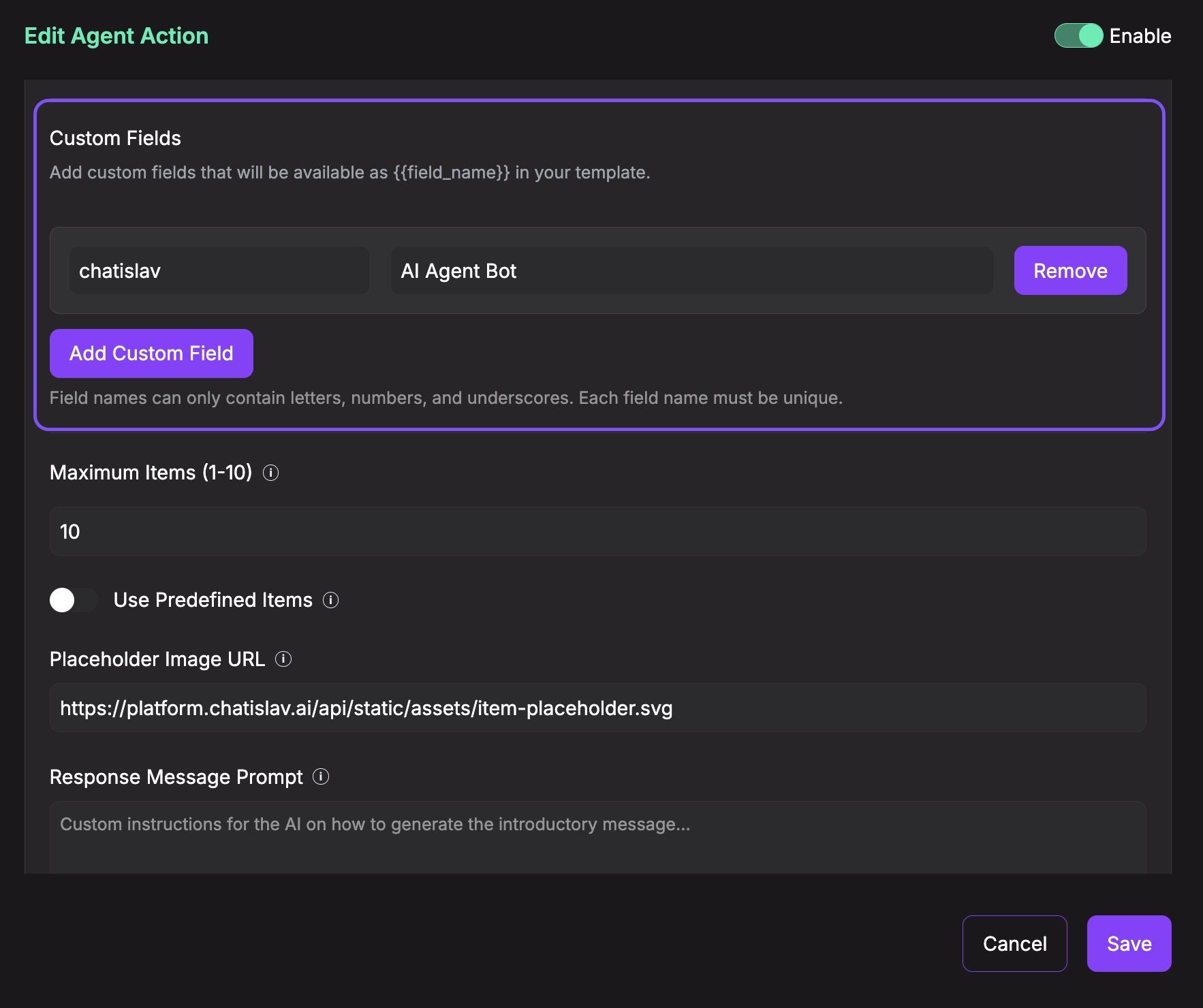
Custom Fields: Add your own fields beyond the standard ones. Click Add Custom Field and provide:
- Field Name: Unique identifier (letters, numbers, underscores only). This becomes a template variable like
{{field_name}} - Field Description (Optional): Helps the AI understand what this field represents
Examples:
brand,category,rating,availability,sku,color,size - Field Name: Unique identifier (letters, numbers, underscores only). This becomes a template variable like
Note: Field names must be unique and cannot use reserved names (name, desc, price, img_url, item_url).
-
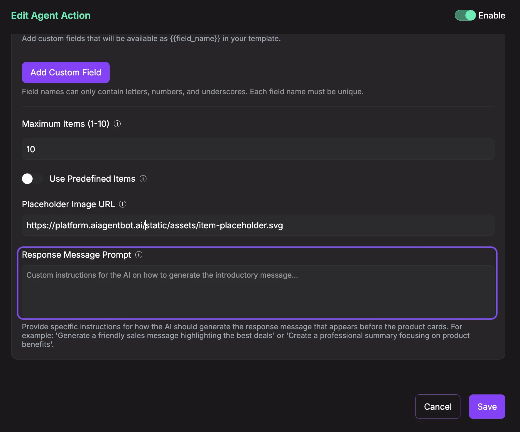
Maximum Items (1-10): Set the maximum number of cards that can be displayed at once. Default is 10.
-
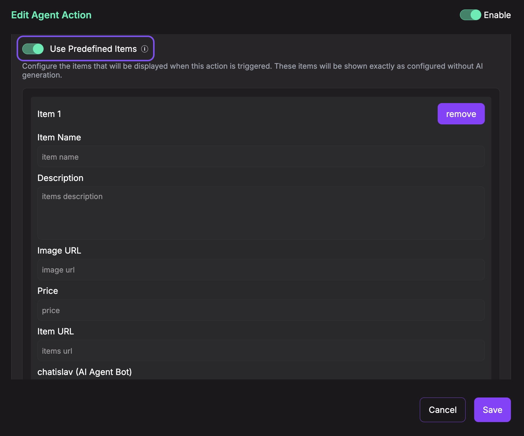
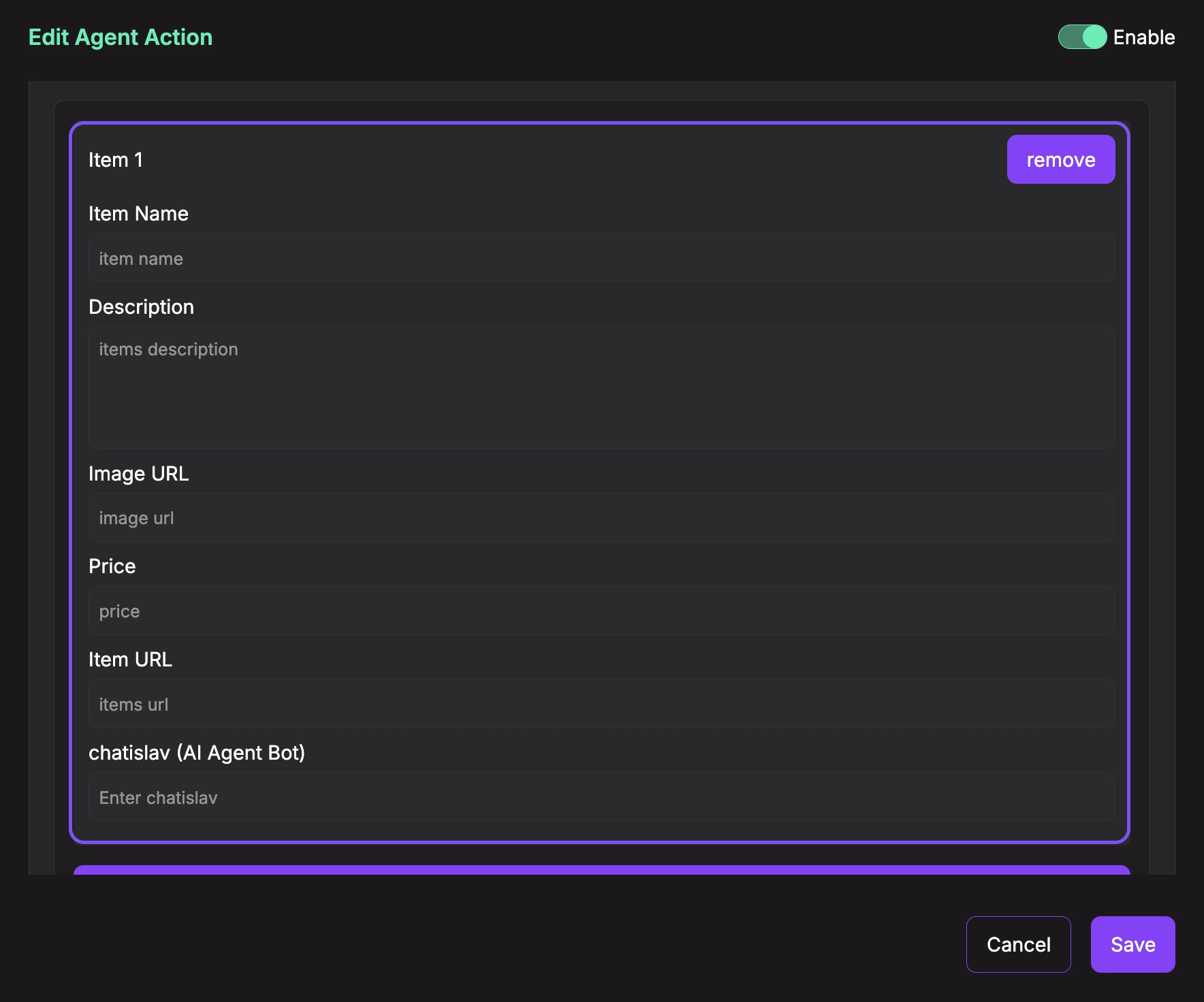
Use Predefined Items: Toggle this option to choose between:
- OFF (default): AI agent generates items dynamically based on the conversation and your knowledge base
- ON: You manually define a fixed set of items that will always be shown. When enabled, you can add/edit items directly in the configuration with all their field values.
- Placeholder Image URL: Provide a fallback image URL to display when an item doesn't have an image. Default uses Chatislav's placeholder.
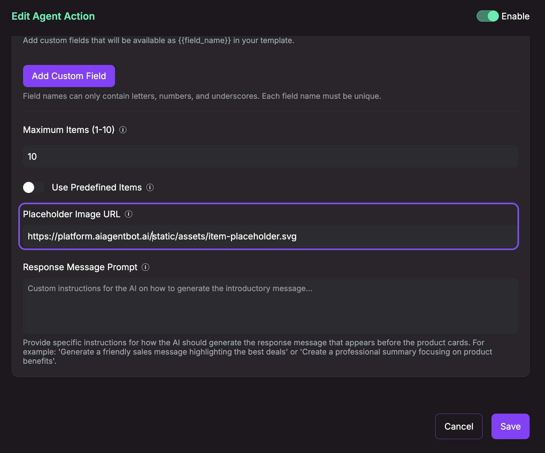
- Response Message Prompt (Optional): Provide instructions for what the AI agent should say before showing the cards. This helps the agent generate an appropriate introductory message that explains what the user is viewing. Leave empty to use the default prompt.
- Save Configuration: Once you've configured all the settings above, make sure the Enable toggle at the top right is ON (green), then click the Save button at the bottom of the configuration panel to save your settings.
-
Enable and Activate: After saving the configuration, make sure to:
- Toggle the Enable switch at the top right to ON (green)
- Click the Save button at the bottom to activate the action
The action will only be available to your AI agent once it's enabled and saved. You can disable it at any time by toggling the Enable switch to OFF.
Show Item Card Preview
When enabled, the agent will call this action to display one or multiple items as visual cards in the conversation. If "Use Predefined Items" is enabled, it will show your fixed set of items; otherwise, it will dynamically generate items based on the conversation context and your knowledge base.
Best Practices
- Use Grid/Flex layout for general product displays (2-4 items)
- Use Horizontal Scroll for showcasing many items (5-10 items)
- Use List layout when you want to show detailed information for each item
- Keep descriptions concise (2-3 sentences) for better card readability
- Use high-quality images with consistent dimensions
- Add custom fields only when they provide value to the user
- For e-commerce: Include
brand,rating,availabilityas custom fields - For real estate: Include
bedrooms,bathrooms,sqftas custom fields - For services: Include
duration,level,instructoras custom fields