Show Action Button
Overview
Enable your AI agent to display interactive action buttons in the chat. These buttons can navigate users to URLs, trigger workflows, or send predefined questions. Perfect for CTAs (Call-to-Actions), navigation, and creating quick-action menus with customizable styling and behavior.
Prerequisites
Before setting up the Show Action Button action, ensure you have:
- ✅ A clear understanding of what actions you want users to take (e.g., "View Pricing", "Contact Sales", "Get Started")
- ✅ URLs or predefined responses ready for your buttons
- ✅ (Optional) A decision on whether to use AI-generated buttons or manual configuration
Step 1: Create Show Action Button Action
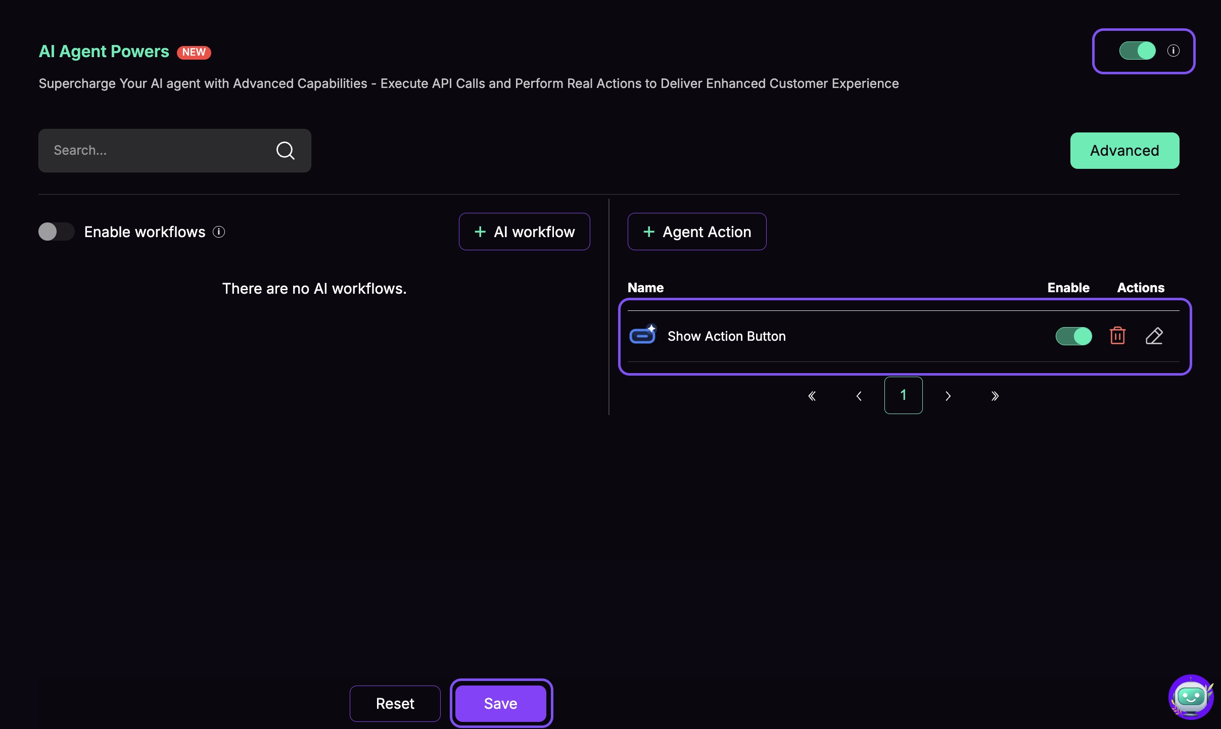
Access Agent Actions
- Go to AI Agent Actions in your dashboard
- Click the Agent Action button to create a new action
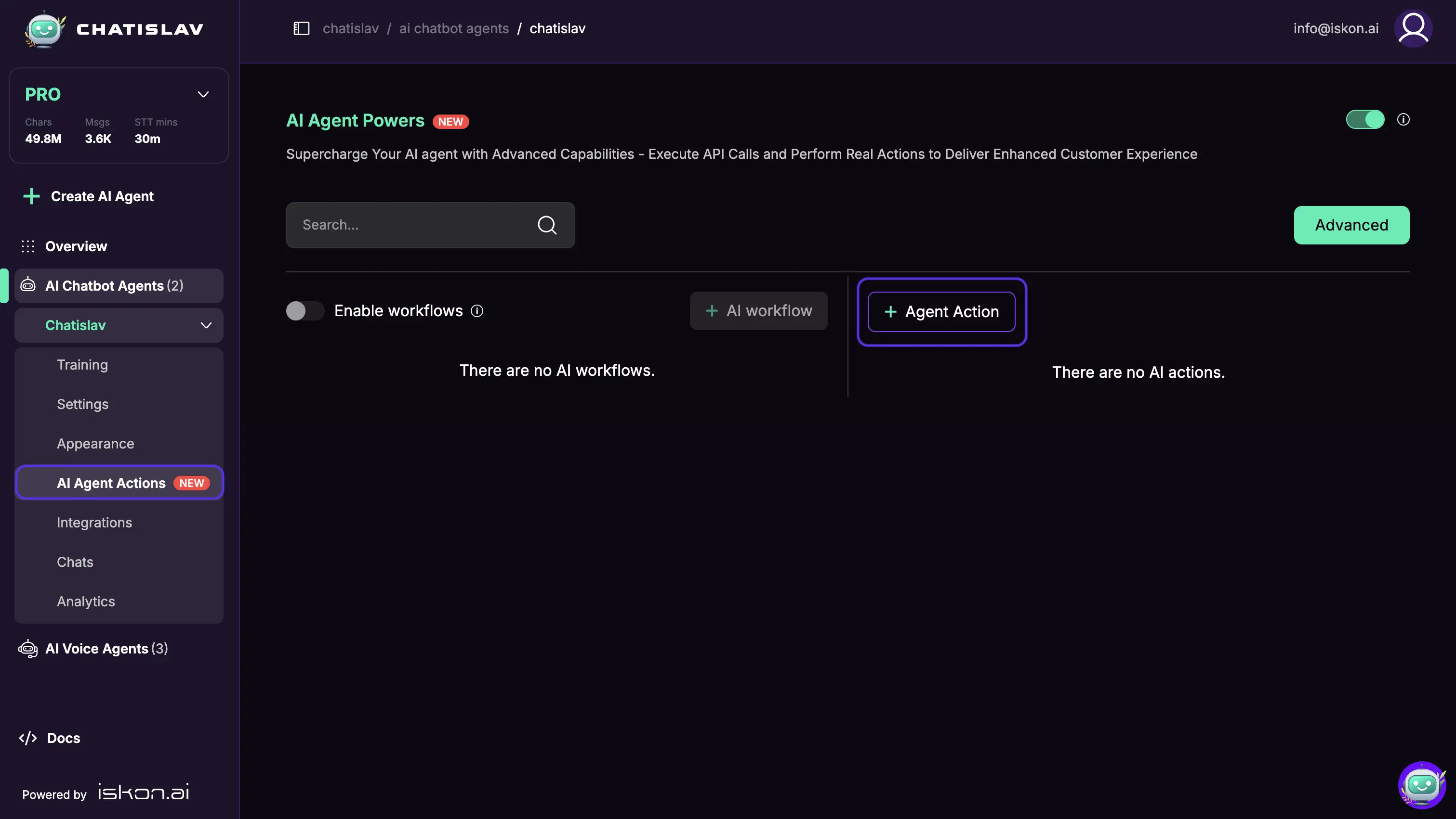
- Select Show Action Button from the list
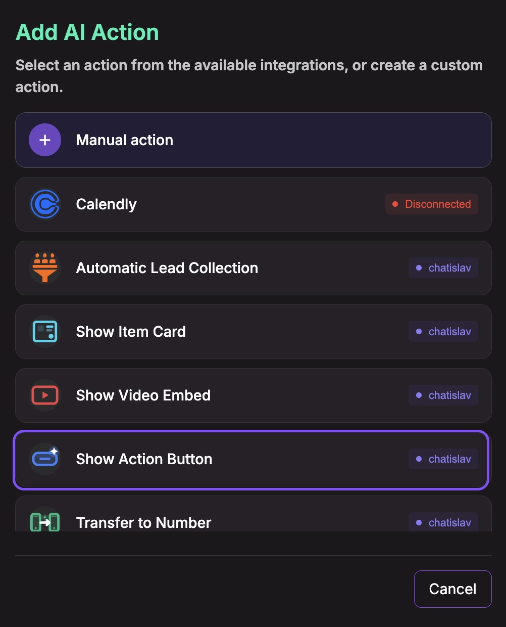
Configure System Tool
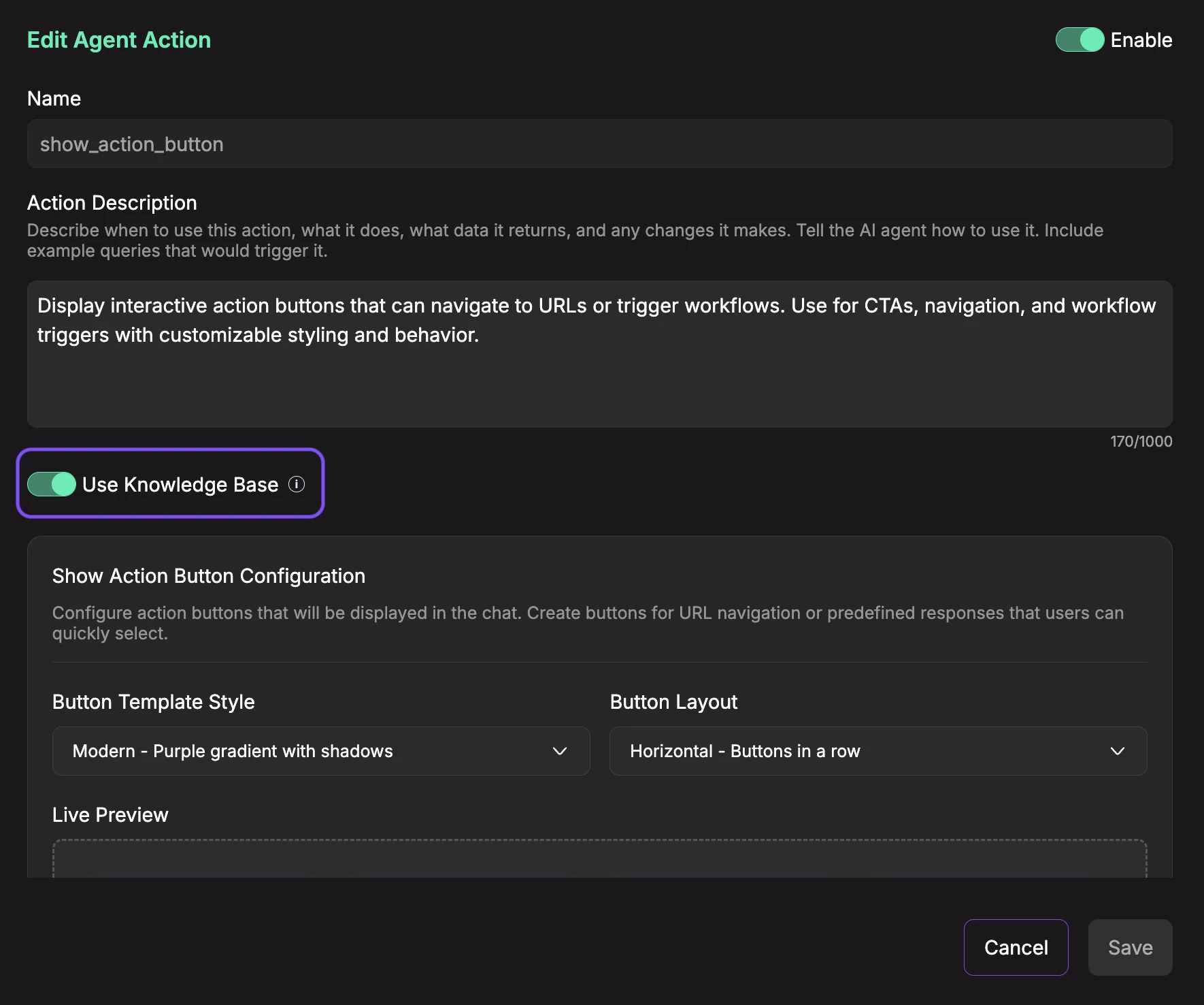
- Enable the action (toggle ON)
- Description: Describe when and how the agent should use this action (e.g., "Display interactive action buttons that can navigate to URLs or trigger workflows. Use for CTAs, navigation, and workflow triggers with customizable styling and behavior.").
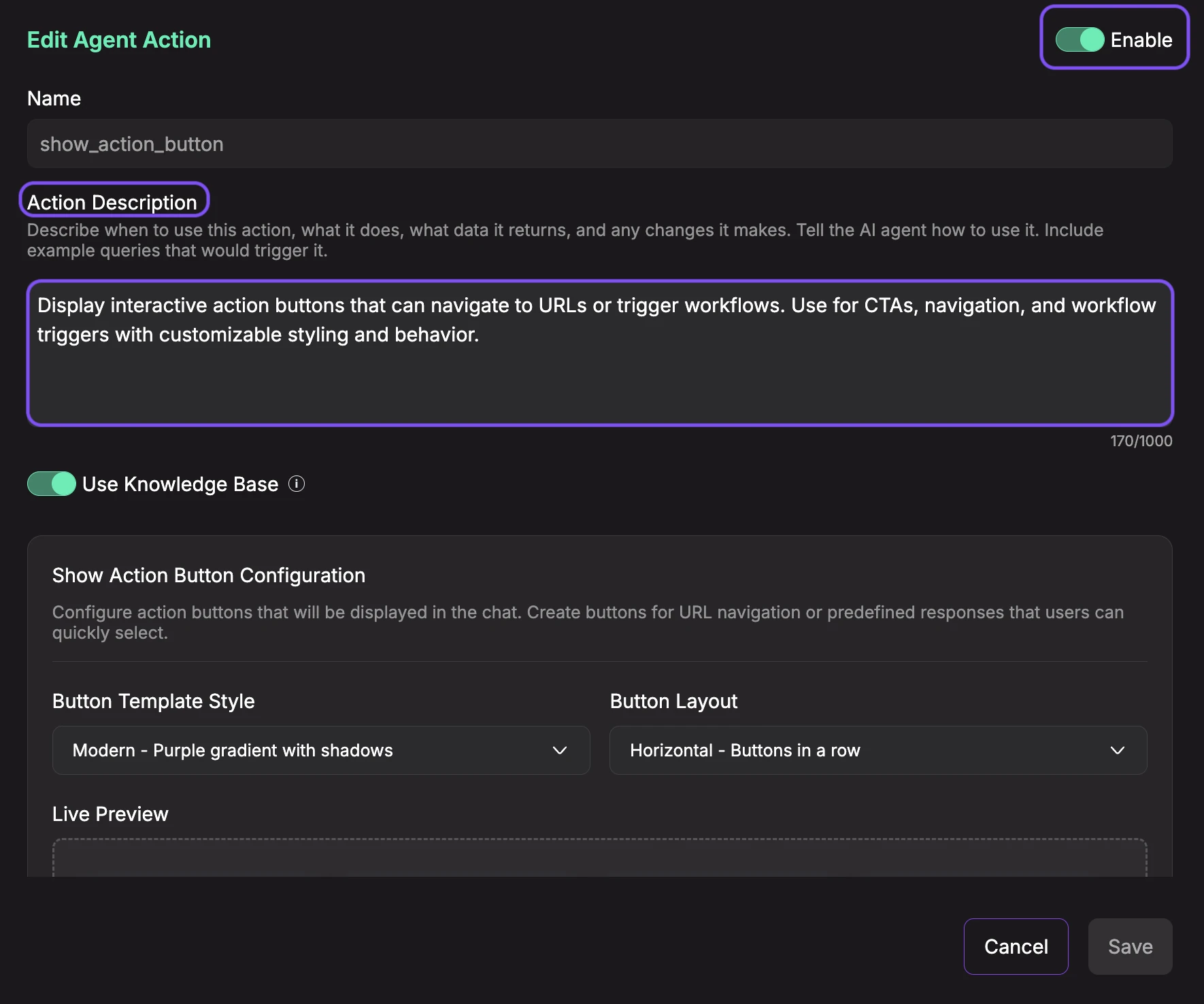
- Use Knowledge Base (toggle): When enabled, the AI agent will reference your uploaded knowledge base documents when generating button labels, URLs, and responses for this action. This allows the agent to create more contextual and accurate action buttons based on your documentation. Keep it disabled if you want the agent to generate buttons based solely on the action's prompt and conversation context.
Show Action Button Configuration
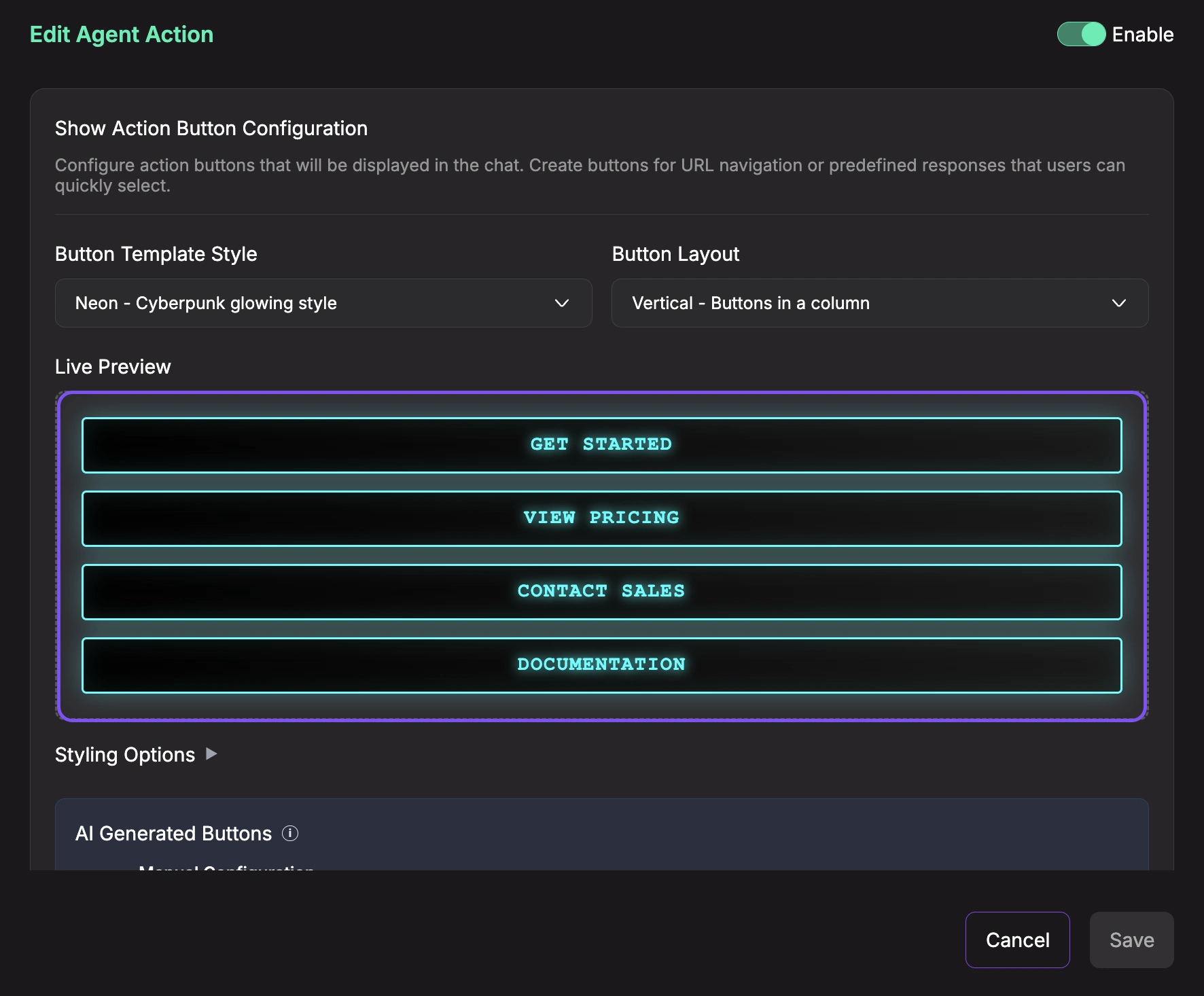
- Button Template Style: Choose the visual style for your buttons. Available templates include:
- Modern - Purple gradient with shadows: Vibrant gradient with modern design and drop shadows
- Classic - Dark slate gradient: Professional dark theme with subtle gradient
- Minimal - Light subtle gradient: Clean, minimalist style with light colors
- Rounded - Pink pill-shaped buttons: Soft, friendly appearance with full border radius
- Outline - Pastel gradient background: Light border style with pastel colors
- Neon - Cyberpunk glowing style: Bold, eye-catching neon effect
- Sunset - Orange to yellow gradient: Warm gradient from orange to yellow
- Ocean - Deep blue wave gradient: Cool ocean-inspired blue gradient
- Galaxy - Purple cosmic gradient: Cosmic purple gradient with space theme
- Forest - Green natural gradient: Natural green gradient with earthy tones
- Custom HTML - Write your own template: Create a fully custom button template with your own HTML and CSS
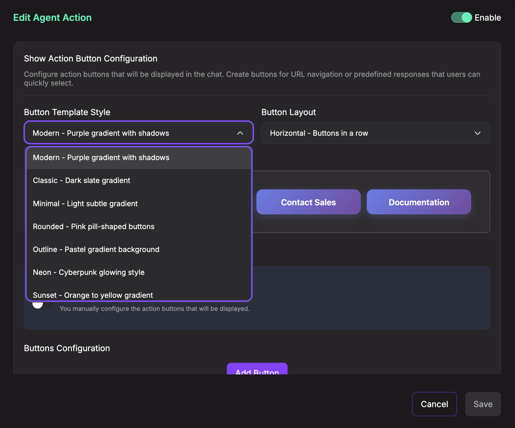
- Button Layout: Choose how buttons are arranged:
- Horizontal - Buttons in a row: Side-by-side layout (recommended for 2-4 buttons)
- Vertical - Buttons in a column: Stacked vertically (recommended for 1-3 buttons)
- Grid - 2 columns layout: Grid layout with 2 columns (recommended for 4-6 buttons)
- Centered - Center-aligned buttons: Buttons centered with space around them
- Reverse End - Right-aligned reverse order: Buttons aligned to the right in reverse order
- Reverse Start - Left-aligned reverse order: Buttons aligned to the left in reverse order
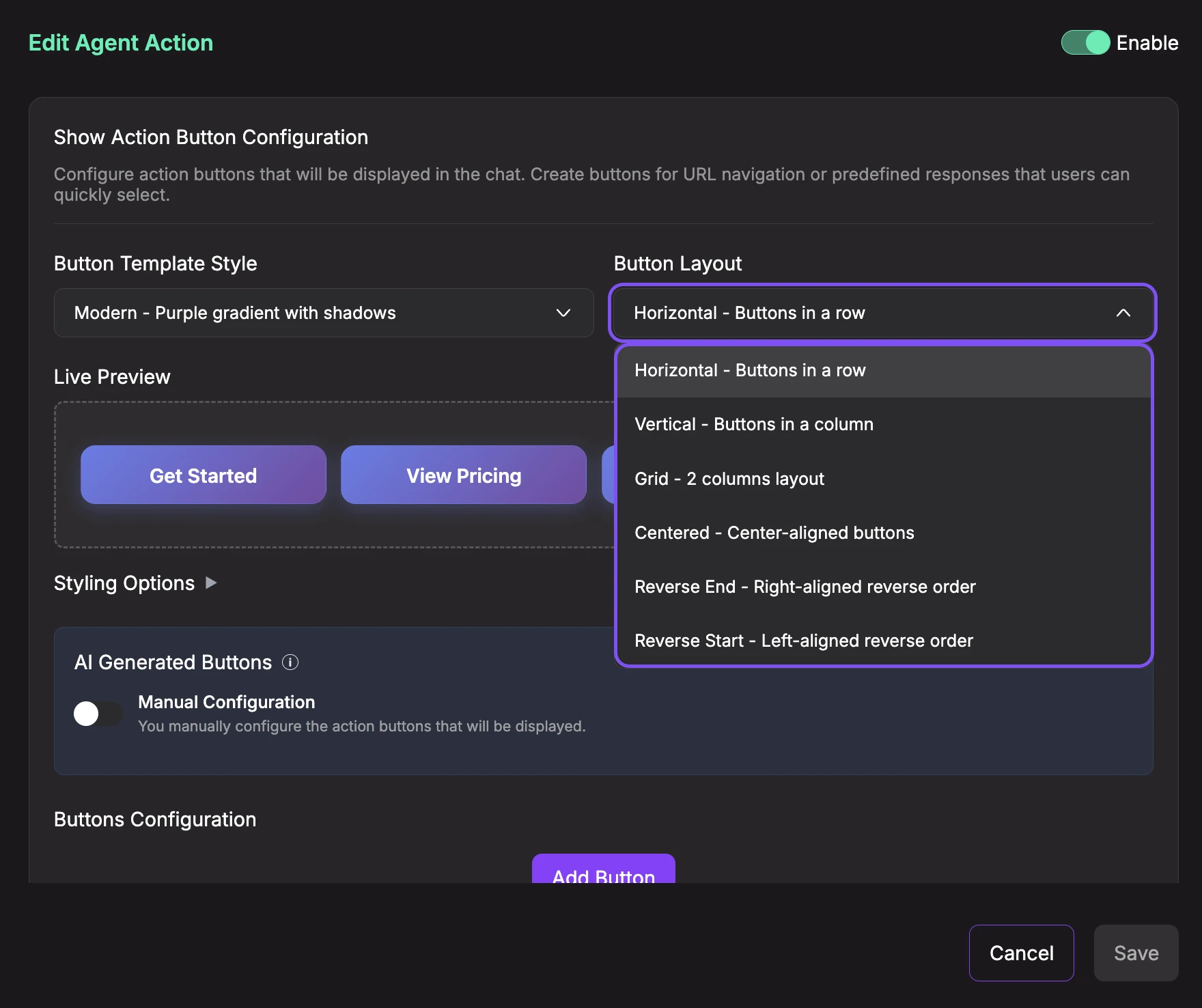
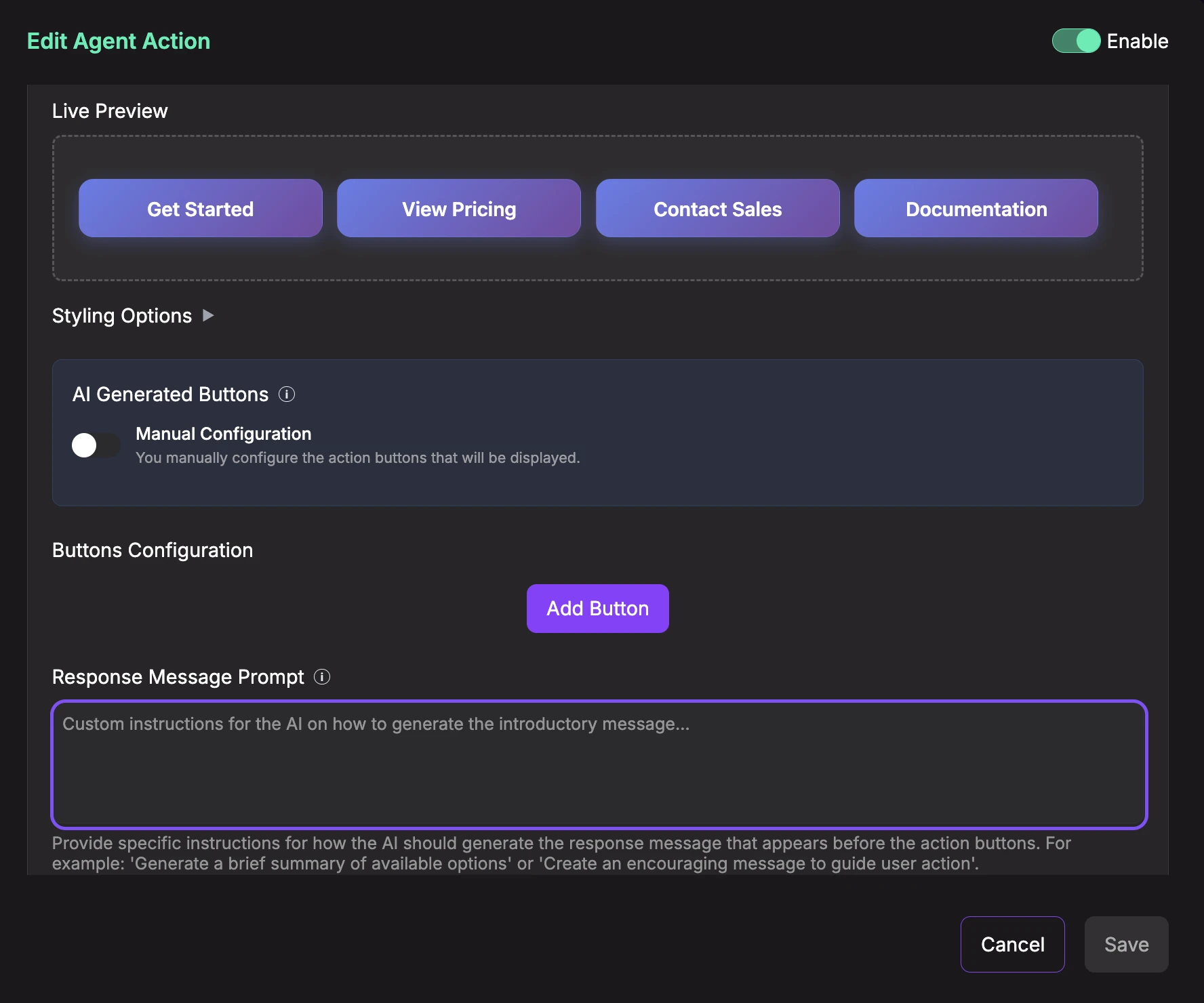
- Live Preview: See a real-time preview of how your action buttons will appear in the chat. The preview updates automatically as you change styles, layout, and button configuration.
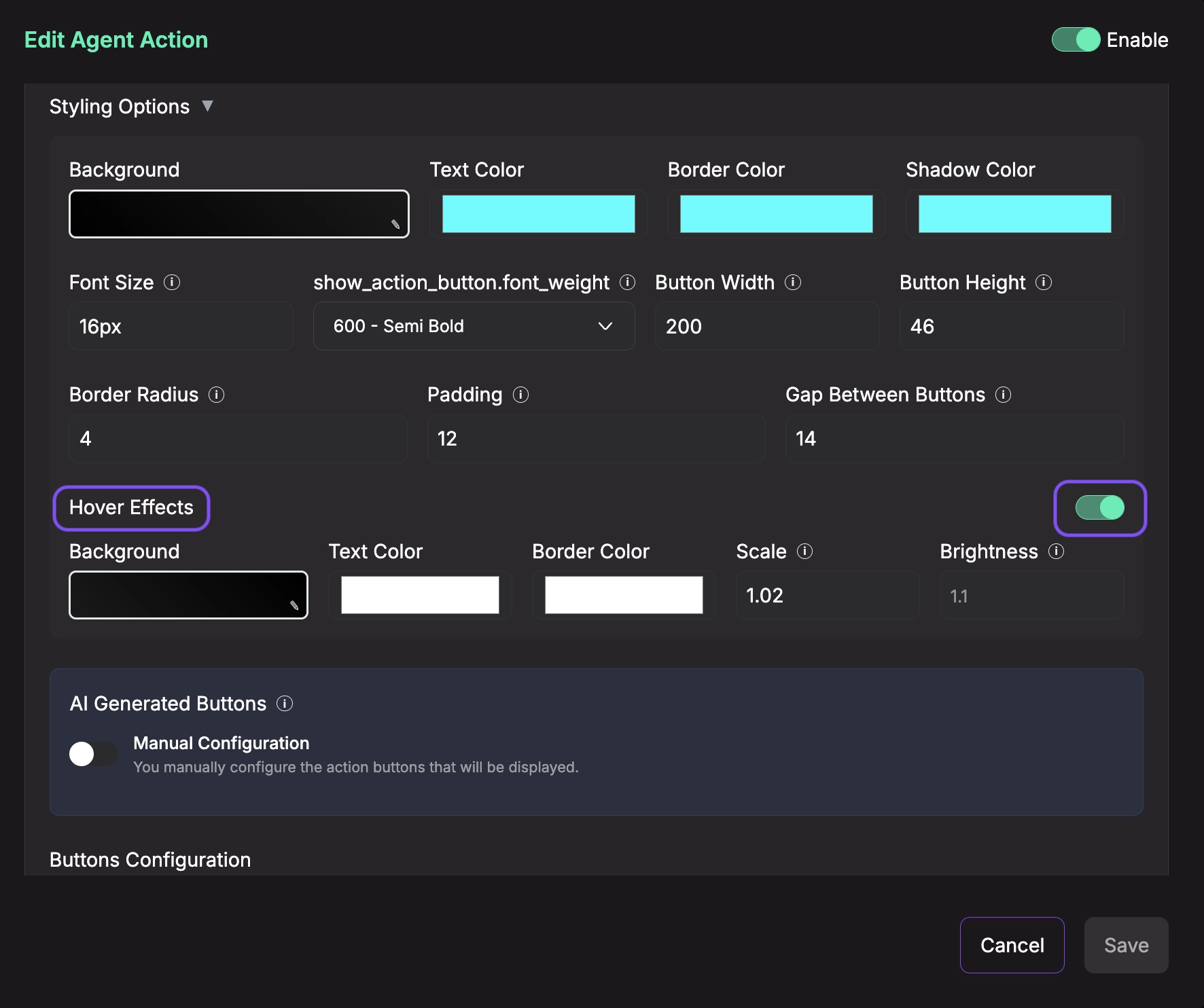
- Styling Options (Optional): Click to expand advanced styling customization. All styling options are optional and have sensible defaults based on your chosen template.
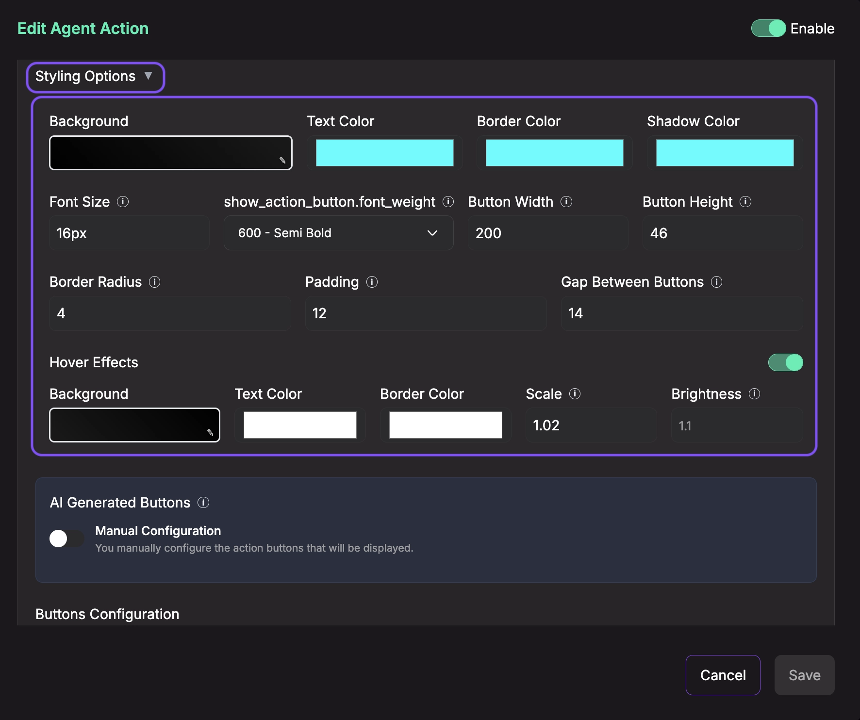
Colors:
- Background: Button background color or gradient (supports solid colors and CSS gradients)
- Text Color: Color of the button text
- Border Color: Color of the button border
- Shadow Color: Color of the button drop shadow
Dimensions:
- Button Width: Width of each button in pixels (50-500px)
- Button Height: Height of each button in pixels (30-200px)
- Padding: Internal spacing inside each button in pixels (0-50px)
- Gap Between Buttons: Spacing between buttons in pixels (0-100px)
Typography:
- Font Size: Text size in pixels (10px-32px)
- Font Weight: Text thickness (100-900, e.g., 400-Regular, 500-Medium, 600-Semi Bold, 700-Bold)
Borders:
- Border Radius: Roundness of button corners in pixels (0-50px)
Hover Effects (Toggle to enable):
- Enable Hover Effects: Turn on/off interactive hover animations
- Hover Background: Background color when user hovers over button
- Hover Text Color: Text color on hover
- Hover Border Color: Border color on hover
- Scale: Button size multiplier on hover (0.5-2.0, e.g., 1.05 = 5% larger)
- Brightness: Button brightness multiplier on hover (0.5-2.0, e.g., 1.1 = 10% brighter)
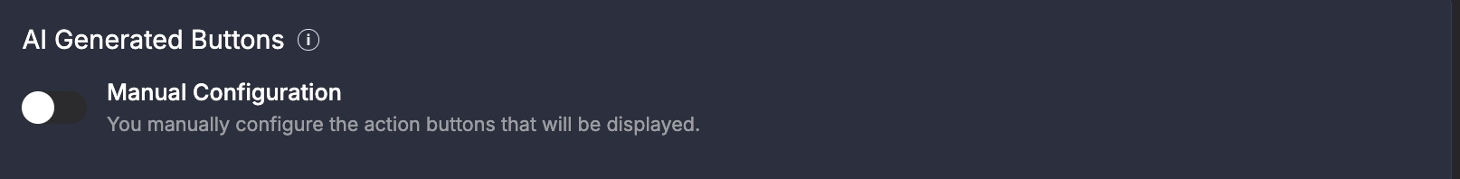
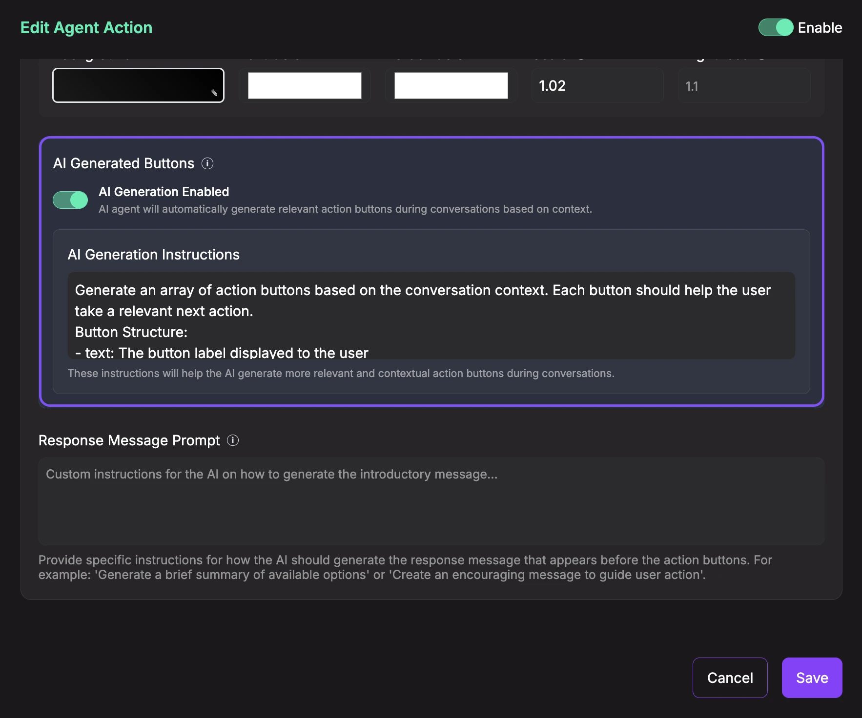
- AI Generated Buttons: Choose between AI-powered button generation or manual configuration.
Option A: AI Generation Enabled
When enabled, the AI agent will automatically generate relevant action buttons during conversations based on context.
- AI Generation Instructions: Provide custom instructions to guide how the AI should generate buttons. Example: "Generate an array of action buttons based on the conversation context. Each button should help the user take a relevant next action. Button Structure: - text: The button label displayed to the user"
This is ideal when you want dynamic, contextual buttons that adapt to each conversation.
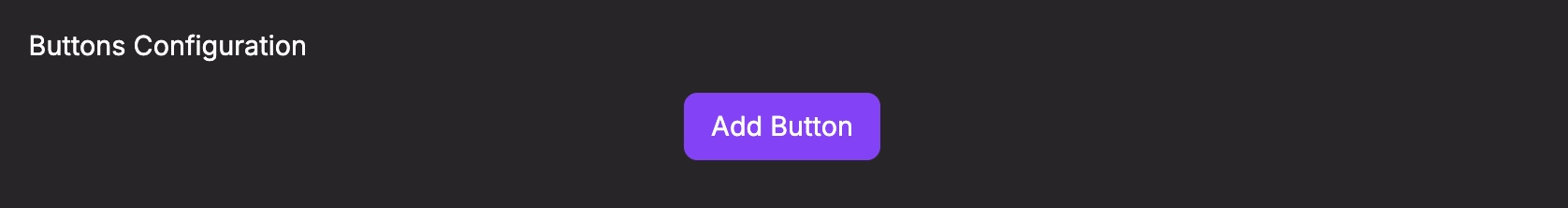
Option B: Manual Configuration
When disabled, you manually configure which buttons to display. Click Add Button to create a new button, then configure:
For each button, configure:
- Button Text: The label displayed on the button (e.g., "Get Started", "View Pricing", "Contact Sales")
- Action Type: Choose the button's behavior from the dropdown:
Option 1: Send Predefined Question
When you select "Send Predefined Question", the button will send a predefined answer to continue the conversation:
- User Response: Enter the answer that will be sent when this button is clicked. This allows you to simulate user responses and guide the conversation flow.

Option 2: Open URL
When you select "Open URL", the button will navigate to a specified URL:
- URL: Enter the full URL where users should be directed (e.g.,
https://example.com/pricing) - Target: Choose how the URL should open:
- Same Tab: Opens the URL in the current browser tab (replaces the chat)
- New Tab: Opens the URL in a new browser tab (keeps the chat open)
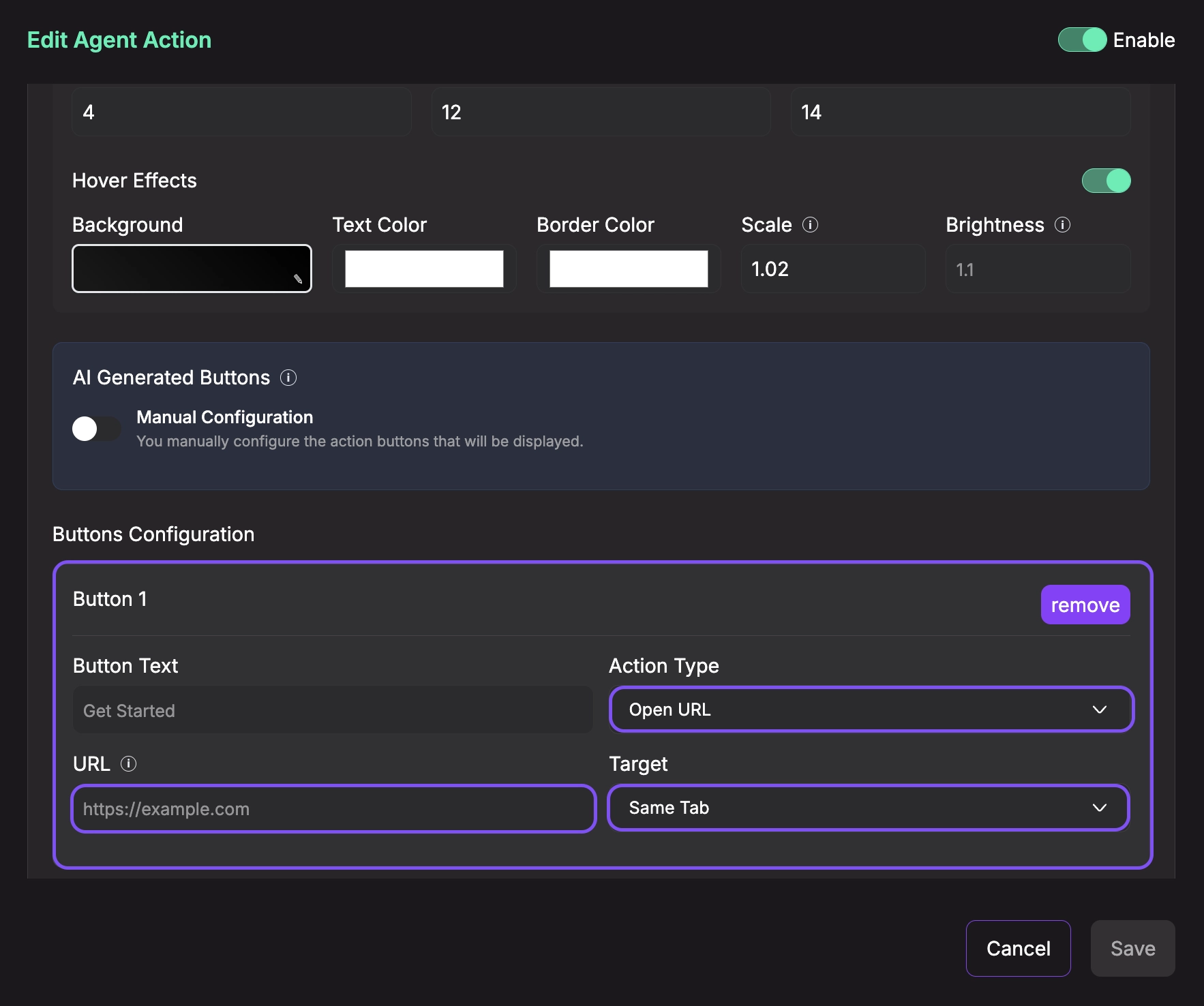
You can add multiple buttons by clicking Add Button again. To remove a button, click the remove button next to it.
- Response Message Prompt (Optional): Provide instructions for what the AI agent should say before showing the buttons. This helps the agent generate an appropriate introductory message that explains the available options. Leave empty to use the default prompt.
- Save Configuration: Once you've configured all the settings above, make sure the Enable toggle at the top right is ON (green), then click the Save button at the bottom of the configuration panel to save your settings.

-
Enable and Activate: After saving the configuration, make sure to:
- Toggle the Enable switch at the top right to ON (green)
- Click the Save button at the bottom to activate the action
The action will only be available to your AI agent once it's enabled and saved. You can disable it at any time by toggling the Enable switch to OFF.
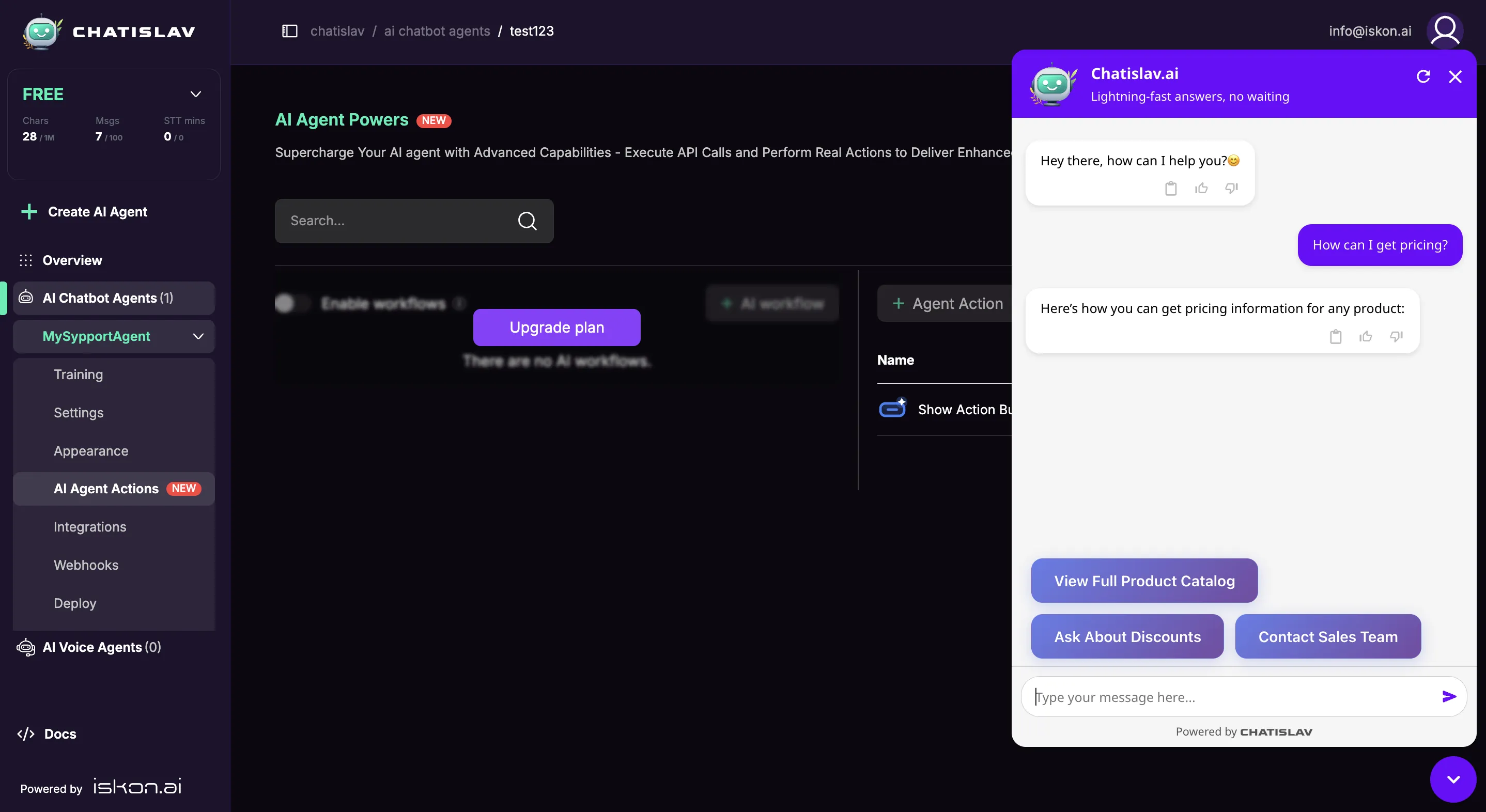
Show Action Button Preview
When enabled, the agent will display action buttons in the conversation. If AI Generation is enabled, it will dynamically create relevant buttons based on conversation context. If manual configuration is used, it will display your pre-configured buttons. When a user clicks a button, it will either open a URL or send a predefined question to continue the conversation.
Best Practices
- Use 2-4 buttons for optimal user experience (avoid overwhelming with too many choices)
- Keep button text short and action-oriented (e.g., "Get Started" instead of "Click here to get started with our platform")
- Use Horizontal layout for 2-4 buttons to maintain visual balance
- Use Vertical layout for single primary CTAs or when space is limited
- For URL buttons, always test links before deploying
- For predefined questions, write natural responses that continue the conversation flow
- Use AI Generation for dynamic, context-aware buttons (e.g., showing different options based on user intent)
- Use Manual Configuration for consistent CTAs that should always appear (e.g., "Contact Sales", "View Pricing")
- Combine both: Use AI Generation for contextual suggestions and manual buttons for fixed CTAs
- Apply consistent styling that matches your brand colors